Logo Design
Does your company’s logo reflect your business? Is it unique? Is it memorable? Is it instantly recognisable to your clients?
Most aren’t.
Nothing devalues your company’s proposition faster than a cheap, badly-designed logo. Yet many businesses are represented by logos that are made up of clip art found on Google, a pixelated photo or something bought from Fiverr.
That’s not to diminish the talent on offer on Fiverr, but most logos from designers on Fiverr are simply a selection of predesigned images from which you select one you like. It’s rarely something designed for your brand.
That’s where we come in.

The best logos are designed for you, following a consultation call and a thorough brief around your business, your values, your clients/customers and WHY they work with you. The logo should be the starting point that influences and impacts all of your designed material, including your website.
And from a personal perspective, there’s nothing worse than designing a great-looking website only for a terrible logo to spoil it! Don’t make us do that – it’s demoralising.
Logo Designs
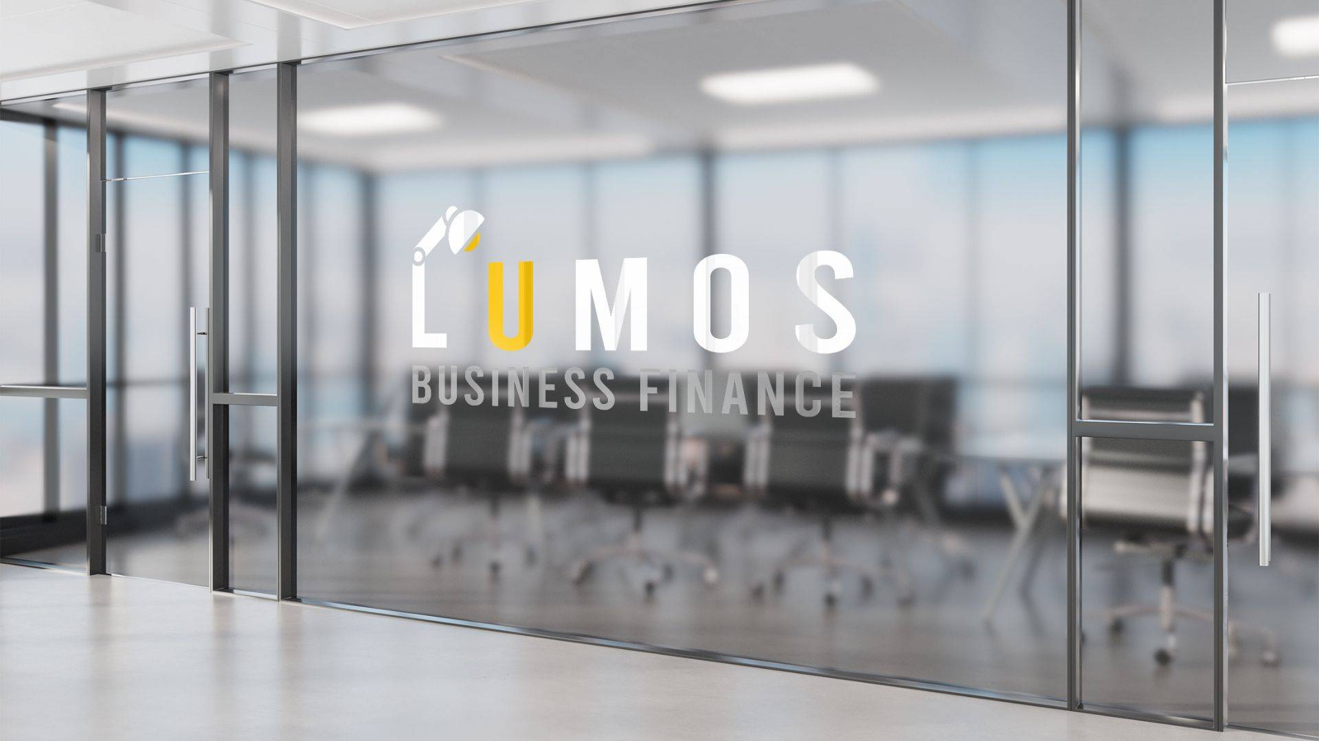
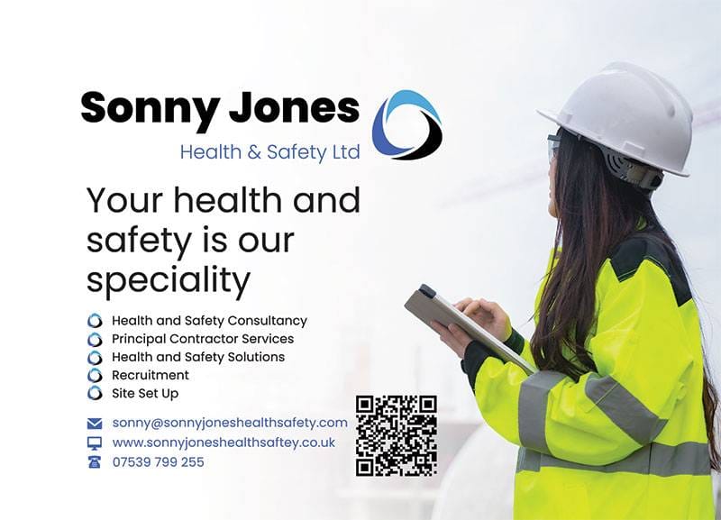
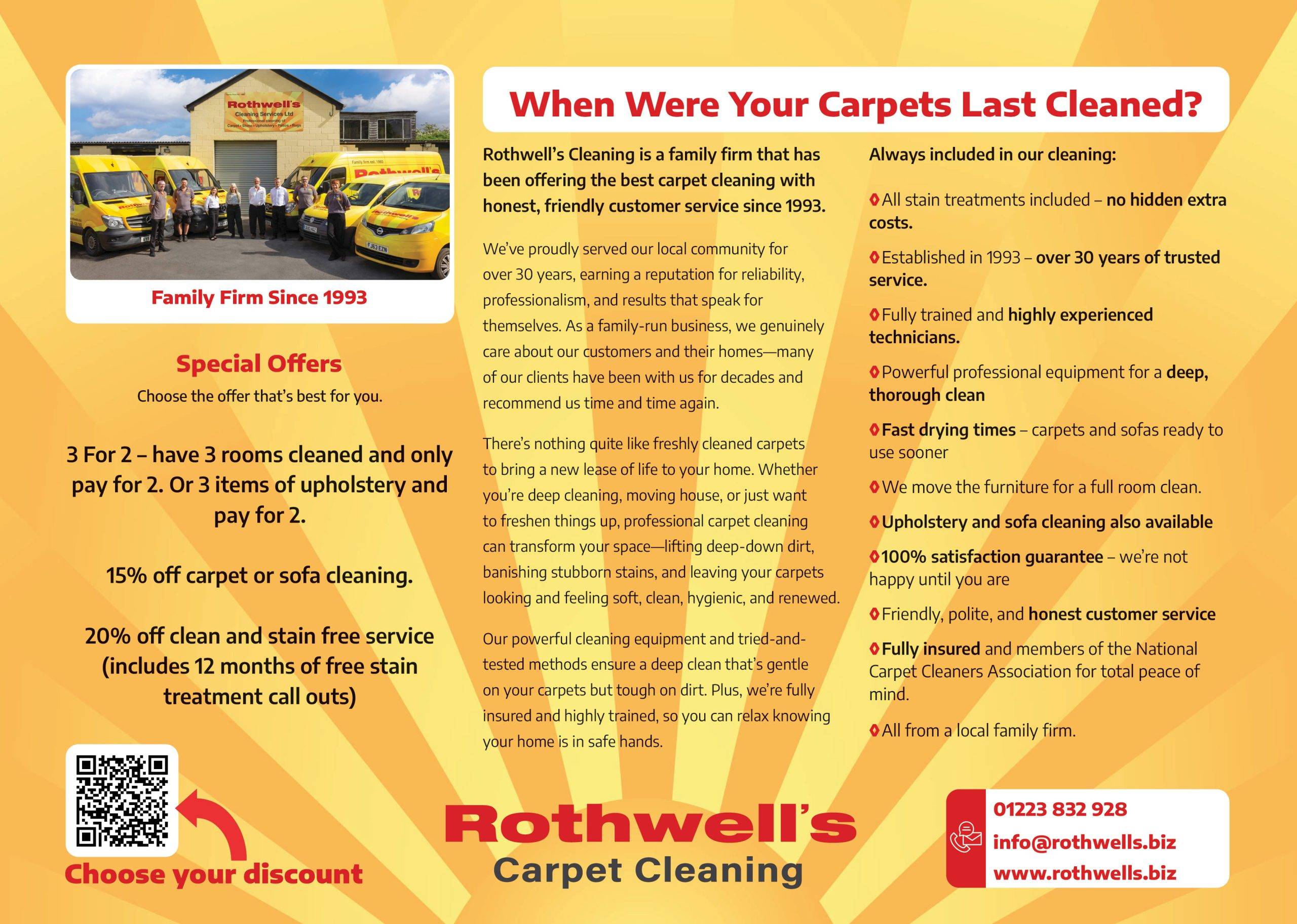
Check out some of the stunning logos we’ve crafted for our clients at Engage Web!
A great logo embodies your brand, making a powerful statement across all platforms and materials
Take a look at some of the branded material we have designed incorporating logo design





Are you looking to elevate your brand with a stunning logo design?
What makes a great logo?
Think about the best brands, the ones whose logos you can instantly picture in your mind. Each of those logos has something in common.
Simplicity
Simplicity – the very best logos are incredibly simple. This doesn’t mean they’re basic, not at all. It means they’ve been very carefully crafted to work with minimal elements. This makes them very easy to remember and identify, even when glimpsed for a few seconds.
Iconography
Iconography – does your logo work even without the name of your business? Our Engage Web logo, for example, features the interlocking EW which can be used on its own, and is still identifiable. Pepsi has the round icon. Apple has the, well, Apple. The words are not even needed.
Typography
Typography – the font your company name uses within your logo is essential for your brand. This should not be one of the standard fonts found on your computer and used within Word, such as Times New Roman – yet many logos do feature this because the designer hasn’t considered the font at all.
Colour
Colour – the best logos feature very few colours, and sometimes no colour at all. Apple, again, is a white logo. It used to have multiple colours but has evolved to become simpler. Coca Cola is shown either as white on red, or red on white. Amazon is black with a simple yellow arrow. Colour is always very carefully used, and never overused.
Clever Touches
Clever Touches – the gold standard of logos feature subtle elements most people won’t spot, at least not consciously. The arrow on the Amazon logo, for instance, starts at the ‘A’ and finishes and the ‘z’ – showing they have everything from A to Z. The Apple logo is made up entirely of perfect circles. The Toblerone logo features a hidden bear – honestly – take a look
To speak to our team about your own logo, and how you can have something simple and brilliant for your business, why not get in touch today?
What makes a BAD logo?
Just as a great logo has some similarities, there are a number of factors that make a poor logo – and we’ve seen many of them over the years. These include:
Clip Art
Clip Art – downloading a piece of clip art and using it as a logo says you don’t care about your business. Your business isn’t worth it. It’s the same as any other competitor, and has nothing to distinguish it.
Photographs
Photographs – a photograph is not a logo.
Complicated Illustrations
Complicated Illustrations – if your ‘logo’ is a complicated illustration, it’s impossible to remember and recall by your clients. The very best logos are extremely simple (or least appear to be). Think of the Apple logo for instance.
Lots of Colours
Lots of Colours – your logo should work with no colour at all, with a white or black version still being recognisable.


